Stop criticizing bizarrely shaped voting districts. They might not be gerrymandered after all
Gerrymandered districts are under fire across the US. But a weird district shape isn't necessarily a bad one.

How can you tell if a voting district has been gerrymandered?
Every 10 years, the U.S. Census informs lawmakers on how to redistribute 435 U.S. congressional seats among the 50 states. Each state must then be partitioned into the appropriate number of voting districts. Since incumbent lawmakers serve as the mapmakers, it’s not uncommon to manipulate district boundaries for political gain.
This behavior, known as “partisan gerrymandering,” is the subject of a U.S. Supreme Court decision expected next year. District shape is perhaps the most common tell-tale sign of gerrymandering, and remains a recurring point of contention.
However, my recent mathematical proof shows that, paradoxically, voting districts will sometimes need to exhibit bizarre shape in order to avoid the appearance of partisan gerrymandering.
The strangest shapes
The term “gerrymander” was coined over 200 years ago, when the Boston Gazette compared the bizarre shape of a Massachusetts voting district to the profile of a salamander.
There are several existing methods to measure what mathematicians call “geographic compactness” (think “non-bizarre-shaped-ness”). The most popular is the Polsby-Popper score.
A weirdly shaped district will waste a lot of its perimeter selectively including certain portions of a map while avoiding others. How can we measure this waste?

For a fixed perimeter, the shape containing the largest area is the circle. In geometry, this is known as the isoperimetric theorem. This motivates the definition of the Polsby-Popper score: the area of a voting district divided by the area of the circle with the same perimeter.
This is meant to measure the inefficiency in the district’s boundary. A circular district would achieve the maximum score of one. Contorted districts would receive a score near zero because they are so far from a circular shape.
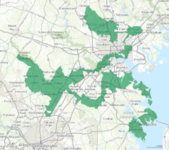
Some of the most egregious offenders of the Polsby-Popper score are located in North Carolina and Maryland. In this spirit, Asheville, North Carolina recently hosted a “Gerrymander 5K” race to put on display the zigzag boundaries of certain atrocious-looking voting districts.
Efficiency gap
However, gerrymandering critics can scrutinize more than just shape. The U.S. Supreme Court is currently deliberating over whether a certain nongeometric feature should be used to detect partisan gerrymandering.
Instead of district shape, the metric of choice in this court case is “efficiency gap.” The efficiency gap captures how disproportionately the votes cast in a given state were “wasted” by the two major parties in an election.
A vote is considered wasted in a district if it either didn’t lead to a majority or wasn’t needed to obtain a majority. The efficiency gap in a state is the difference between the total numbers of wasted votes divided by the total number of votes cast.
If the plaintiffs’ proposal goes through, an unjustified efficiency gap above 8 percent would implicate unconstitutional partisan gerrymandering. While this threshold of 8 percent is somewhat subjective, it was selected after studying efficiency gaps across the country in pursuit of a court-worthy standard.
When weird shapes work
My colleagues and I imagined a case in which both of the following occur simultaneously. First, one party (say, blue) has a slight majority over the entire state. Second, the voters from both parties (blue and red) are very well-distributed.
In this case, a mapmaker would have to exercise a lot of care in order to ensure that red doesn’t waste all of its votes. Since the voters are well-distributed, naively drawn districts will give blue a slight majority, thereby producing a huge efficiency gap in favor of blue. In fact, any simple recognizable shape like a circle or rectangle won’t be competitive politically.
We found that this occurs whenever a district has a Polsby-Popper score that isn’t too small. In other words, a geographically compact district (in the Polsby-Popper sense) will necessarily waste every red vote and almost no blue votes in this case. There is a fundamental tension between the Polsby-Popper score and the efficiency gap.

Our theorem remains true if you change the voter distribution in various ways. For example, if we flipped all the red voters in a given region to blue, then we would get a similarly large efficiency gap.
In fact, Massachusetts provides a real-world example of our theorem. Democrats won all nine of the congressional districts in 2016, even though the districts don’t appear to be gerrymandered. In this state, Republicans make up about 30 percent of the electorate, but the voters are so geographically spread out that their votes are wasted in normal-looking voting districts.
Kicking the habit
The efficiency gap proposal that the Supreme Court is now considering includes a legal test on the back end. This test serves as a sort of fail-safe against any unforeseen shortcomings of the efficiency gap. It allows mapmakers to break the efficiency gap requirement in exceptional cases, provided they offer sufficient justification.
Of course, if the justification process is particularly burdensome, then mapmakers may decide to avoid the process altogether by hunting for districts that minimize efficiency gap. As our theorem demonstrates, this could in turn encourage bizarrely shaped districts.

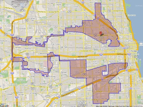
But are strange shapes necessarily bad? Consider Illinois’s Fourth Congressional District, which is frequently lambasted for its peculiar “earmuffs” shape. This odd shape doesn’t necessarily demonstrate bad intentions. In this case, the district was “gerrymandered” so as to connect two majority Hispanic parts of Chicago, thereby providing a common voice to this demographic. So it’s not unprecedented to sacrifice shape in favor of a more substantive ideal.
Next year, the U.S. Supreme Court may decide that a small efficiency gap is an ideal worth pursuing in our voting districts. If so, we should probably kick our habit of judging a district by its shape.
Dustin G. Mixon receives funding from the Air Force Office of Scientific Research.
Read These Next
Thoreau the scientist – how environmental research informed ‘Walden’ and later works
Thoreau’s work as a pioneering physical scientist is almost invisible in popular culture, according…
Teens aren’t as disengaged as you may think: What adults get wrong about adolescents’ civic contribu
Young people don’t all contribute in the same way, and understanding the broader picture is the starting…
Why Trump’s $2 billion buyoff to cancel offshore wind farms is a bad deal for American taxpayers and
Communities have been laying the groundwork for offshore energy projects for years and counting on the…


