Real pay data show Trump's 'blue collar boom' is more of a bust for US workers, in 3 charts
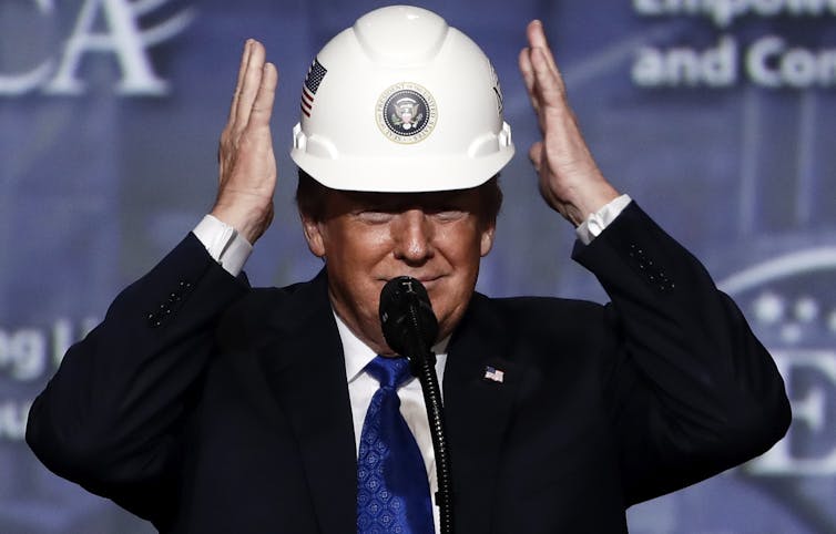
In his State of the Union address, Trump said workers are experiencing a boom in wages. The numbers say different.

If you thought workers’ hourly pay was finally rising, think again.
At first glance, the latest data – which came out on Feb. 7 – look pretty good. They show nominal hourly earnings rose 3.1% in January from a year earlier.
But the operative word here is nominal, which means not adjusted for changes in the cost of living. Once you factor in inflation, the picture changes drastically. And far from representing a “blue collar boom” – as the president put it in his State of the Union address – the real, inflation-adjusted data show most U.S. workers have not benefited from the growing economy.
As an economist who studies wage data, I think it’s paramount that we take a step back and look at what the data really show.
The effect of inflation and fringes
The Bureau of Labor Statistics comes out with two sets of data on wages.
Business journalists and financial markets tend to focus on the monthly data. These figures are only reported in nominal or current terms because the inflation data doesn’t come out until later.
A more complete set of wage and pay data is reported quarterly. The latest release came out in December for the third quarter. These figures are not only adjusted for inflation but also include fringe benefits, which account for just under a third of total compensation.
At first blush, it makes sense to focus primarily on the first set. Newer data is, well, newer, and market participants and companies prefer the latest information when making decisions about investments, hiring and so on.
But the effect of inflation means that the same US$1 bill buys less stuff over time as prices increase.
From December 2016 to September 2019, nominal wages rose 6.79% from $22.83 to $24.38. But after factoring in inflation, average wages barely budged, climbing just 0.42% in the period.
Incorporating fringe benefits into the picture adds another wrinkle.
The inflation-adjusted or real value of fringe benefits, which include compensation that comes in the form of health insurance, retirement and bonuses, declined 1.7% in the three-year period.
Altogether, that means total real compensation slipped 0.22% from the end of 2016 to September 2019.
Of course, workers in different sectors have fared differently. The Trump administration has singled out manufacturing workers – who it says are the main beneficiaries of its trade war and other policies intended to support the sector – as having benefited from a “blue collar boom” in wages.

The nominal data for manufacturing workers hardly support a boom but they do show an increase of 2.22% since Donald Trump took office.
The adjusted data, however, make it look more like a bust, with wages plunging 3.88% in the period. And, again, the situation is worse when we add in fringe benefits, which brings the decline to 4.33%.
So next time you read a story about a rise in pay, try to see if it reports the wage data in nominal or real terms, and if it includes fringe benefits too. If it’s only nominal wages, the numbers may mean a lot less than they seem.
[Get the best of The Conversation, every weekend. Sign up for our weekly newsletter.]
David Salkever does not work for, consult, own shares in or receive funding from any company or organization that would benefit from this article, and has disclosed no relevant affiliations beyond their academic appointment.
Read These Next
Why the 60-day War Powers Resolution deadline doesn’t actually constrain presidents
Donald Trump’s unilateral move to engage in military action against Iran isn’t unprecedented; Presidents…
What’s in the price of a gallon of gas?
As US gas prices climb, politicians are looking at ways to lower them. An economist breaks down what…
AI chatbots can prioritize flattery over facts – and that carries serious risks
Everyone likes being told they’re clever, even if it’s coming from an AI chatbot. But their sycophancy…


